CASE STUDIES
Below are a collection of case studies that illustrate my work, outlining the challenges encountered, the strategies applied, and the results achieved. Each example offers an in-depth view of my collaborative, design-driven approach to creative problem-solving. To protect client confidentiality, specific project materials are not displayed.
Case Study #1: Content development
story-telling
Challenge: Our team lacked a shared understanding of how a key content type was created, from initial idea to tagging, structuring, publishing, and delivery. The absence of a clear visual process made it difficult for teams to align and collaborate effectively.
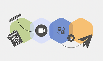
Approach: I co-led a cross-functional workshop to document each step of the content development process. To make the complex workflow more relatable, I created a travel metaphor, comparing stages of content creation to taking a trip.
Outcome: The metaphor and visual framework helped teams build a shared understanding of the full content lifecycle. It improved cross-team communication, enabled more productive conversations, and strengthened collaboration across roles.

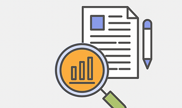
Case Study #4: Designing a dashboard for smarter content reviews
Challenge: The clinical team at Healthwise needed visibility into what was working and what wasn't. They needed an easy way to track data for content in their review bundles.
Approach: Working in content analytics, I designed and built a self-serve dashboard that aligned directly with the team's content review bundles that could be filtered by bundle name. The dashboard displayed most and least-used content, highest and lowest-rated content, and the reasons behind user ratings.
Outcome: The dashboard became a go-to tool for planning content enhancements and prioritizing updates. It empowered the team to make informed, user-centered decisions, turning raw data into clear, actionable insights.

Case Study #2: Visualizing a unified content delivery system
Challenge: After a company acquisition, content was being created and delivered through multiple legacy systems. The team needed user-friendly documentation and visuals to compare approaches and envision a unified future.
Approach: I collaborated with content, engineering, and product stakeholders to learn how each system operated. Using those insights, I designed a clear comparative diagram of the current and proposed systems, highlighting overlaps, gaps, and areas for integration.
Outcome: The diagram became a key reference point for decision-making. It helped the team grasp system similarities and differences, communicate more effectively across disciplines, and build confidence in the vision for a unified system.

Case Study #5: Improving health messaging using IDEO framework
Challenge: While working at a health department, our community faced an outbreak that was disproportionately affecting teens. Traditional health communication approaches weren't resonating with this age group.
Approach: Using IDEO's human-centered design framework, our team researched the needs, concerns, and motivations of teens and their parents. We synthesized our insights into key messaging themes and developed a teen-friendly campaign that balanced approachability with medical accuracy.
Outcome: Just as we planned to launch our campaign, COVID-19 restrictions were announced, so we were unable to host our planned clinic, but the experience with IDEO's framework helped our team adopt a human-centered design approach to health messaging.

Case Study #3: Building a better image library
Challenge: Our organization had licensed tens of thousands of stock images and needed a visual strategy for managing them. Teams couldn't easily find or repurpose assets, and content reuse was inefficient.
Approach: I developed assessment criteria for sorting the photos and led a team of freelancers through the vetting and tagging process. I built a folder structure within our digital asset management system and partnered with a developer to automate the transfer of approved assets via API.
Outcome: The result was a scalable, searchable, and well-organized image library that improved access, supported brand consistency, reduced time spent sourcing assets, and saved money repurposing licensed images rather than purchase new.
Case Study #6: Visualizing KPIs for Product Leadership
Challenge: The product team at Healthwise needed a better way to track and communicate KPIs, especially in leadership meetings. Their existing process lacked automation, trend visibility, and visual clarity.
Approach: I teamed up with a Product Manager to define relevant KPIs, then built a PowerBI data model to capture and calculate key metrics (including writing custom DAX for 30-day rolling averages). I designed an interactive dashboard that visualized trends, highlighted changes over time, and made it easy to extract screenshot-ready visuals with interpretation-ready talking points.
Outcome: The Product Manager used the dashboard in executive meetings to clearly communicate product performance and trends. It became a trusted tool for strategic planning, turning complex metrics into a visual story that supported confident decision-making.